PORTFOLIO ‧ SOFTWARE ‧ WEBSITE
Making my own website
Mar 2025You’re looking at it right now!
 By Wessel van Dam ‧ March 2, 2025
The website you’re on right now has a long history. While I have a different post dedicated to the purpose of my website, this post is more about the process of building it, which took longer than I anticipated. While it may not look like much to some, a lot of thinking and some failed attempts preceded this, which has been both frustrating and insightful.
Getting started
I’m not entirely sure when I decided that I wanted my own website, but I started working on it somewhere during my exchange in Stockholm. I was heavily inspired by GatesNotes, the website of philanthropist Bill Gates, and the type of content that was on there. I was also obsessed with the idea of making my site hyper-symmetrical. My website’s tagline had to consist of three items, because the content was split into a blog part consisting of three categories (Thoughts, Stories, and Content) and an about part consisting of three categories (Portfolio, Experience, and Education).1 Here’s a little video showing the version I made at the time using Svelte:
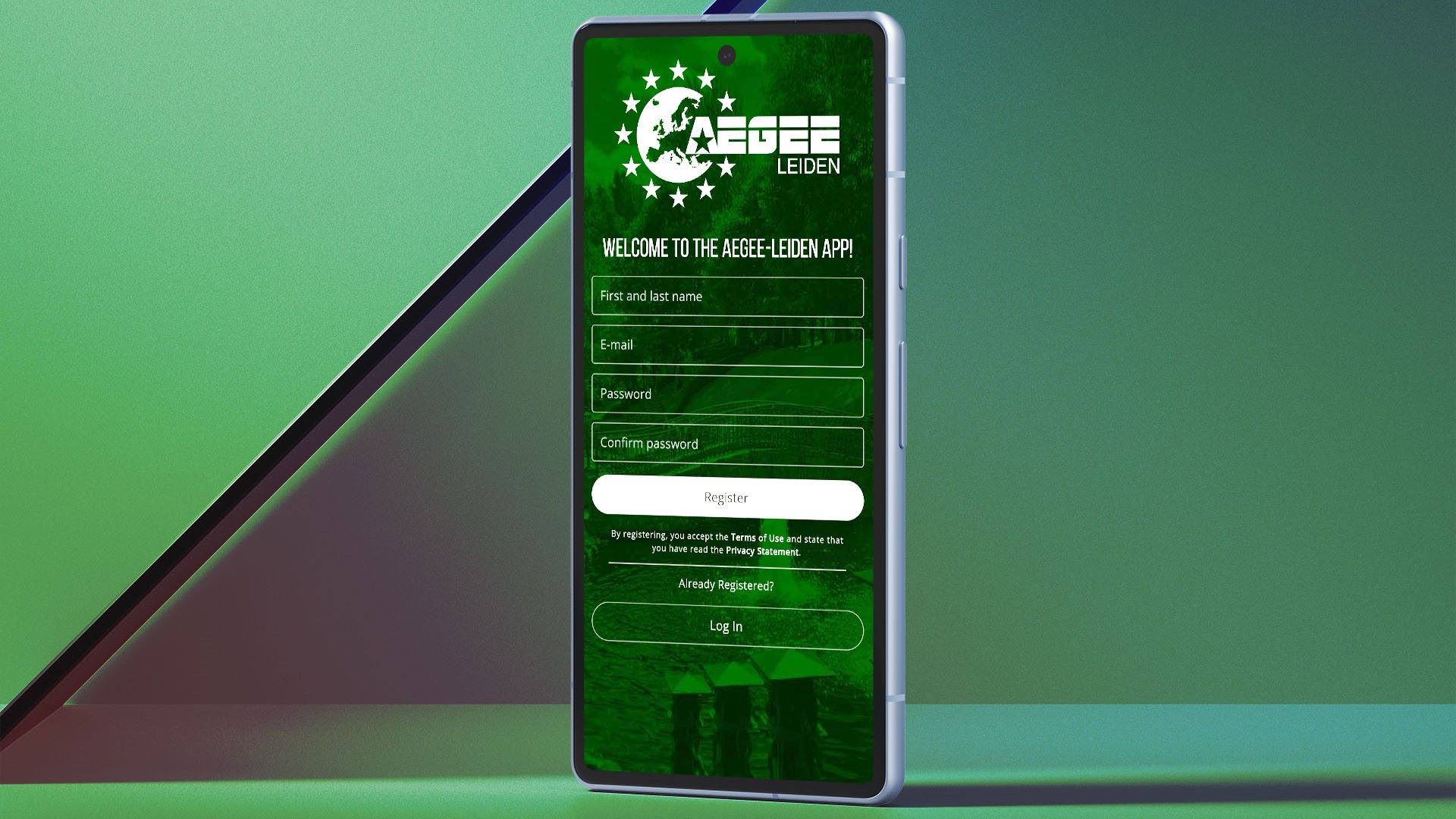
It was my first true experience building a website (not counting the web version of the AEGEE-Leiden App), as well as my first experience with Svelte. Although I liked the animations and transitions, I wasn’t happy with a lot of things, and didn’t give the project much thought once I started my internship and wrote my thesis for my master’s degree.
Attempt number two
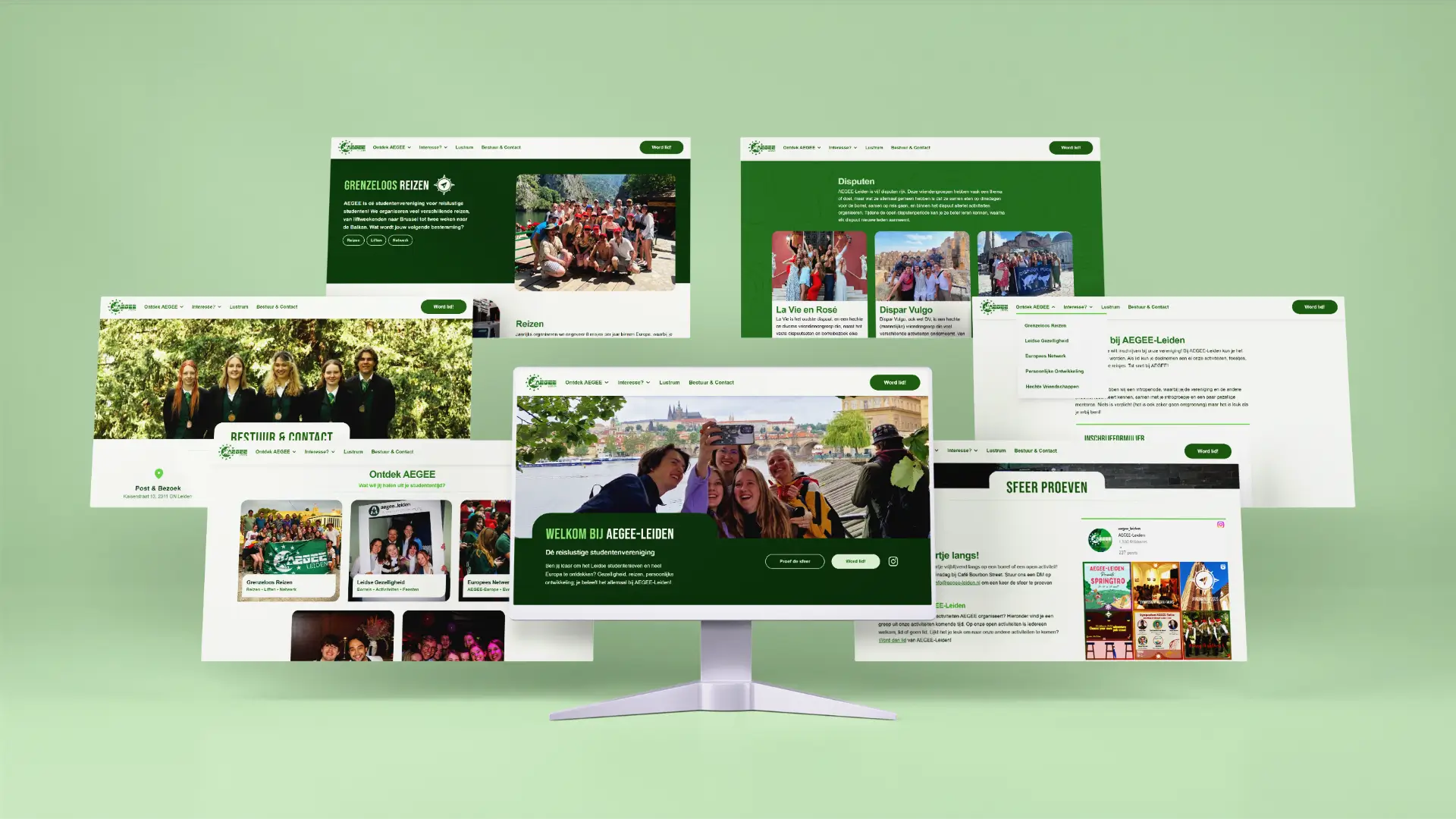
Although continuing this project was on my mind occasionally, I only really started working on it again after finishing the Thank You Token Project. Where I initially had chosen Svelte to expand my skillset, I now chose to start over in Flutter as it was the framework I was most confident with and I didn’t want the technical side of the project to slow me down. Inspired by my work on the AEGEE-Leiden website, I started making some designs in Figma first, as opposed to diving into the code right away. I had a clear vision of the homepage having my logo, four featured posts, and a ‘read more’ tile, which I implemented in October 2024:
Soon after, I paused work on my website to focus on AEGEE’s site instead. During this time, I read the books Refactoring UI by Adam Wathan (creator of TailwindCSS) and Steve Schoger and Laws of UX by Jon Yablonski. I had always felt that design was my weak spot (despite continously taking on design projects within AEGEE), and these books were truly enlightening. All this time, I wanted my website to be special and impressive, but after reading these books, I decided that I should learn to master the basics first.
The final site
Just like the AEGEE site, this one is built with Hugo and TailwindCSS. This time, I strongly modeled the design after GatesNotes, with some enhancements here and there. Still, you will see traces of the earlier versions in this site. I paid close attention the design principes I learned from the books (e.g. contrast, whitespace, and hierarchy), and made the site revolve more around the content than the design. Special attention was given to the responsiveness of the site, as I wanted it to look good on all devices.
About the content
Essentially, this website is a collection of posts, but these posts are divided into four categories:
- Portfolio: Software, design and other projects I have finished, often in the context of my student’s association AEGEE-Leiden, but this will be more diverse in the future.
- Career: My education, jobs, and other professional experiences — the typical LinkedIn stuff.
- Thoughts: A blog-like section, with posts about my thoughts on various topics, as well as some essay-like writings.
- Content: A repository of content I’ve come across that I recommend, such as books, videos, and podcasts.
The latter two categories don’t have a lot of posts yet, but I hope to add more in the future. I found that it is difficult to find relevant banner images for these posts, so I typically just use some semi-random photographs I’ve taken.
The homepage shows featured articles, hand-picked by me based on what I’m most proud of and on what I think readers would find interesting. Prior to getting this site live, I had to write a lot of posts, which proved to be quite the challenge. Anytime I look back on a post I’ve written, I’ll notice something that I want to change. I’ll need to resist that urge, though, lest I get stuck in an endless loop of editing.
Conclusion
I will probably never consider this website truly finished, as I will always want to add new features or change the design. Nevertheless, I am much happier with this version than with the prototypes I made before, as it feels more mature, more accessible, and more focused on the content. In that regard, compiling and writing all the content for this site has been a great exercise, as I had about seven years of experience to reflect on. Now that the website finished, I hope it fulfills its aforementioned purpose well — and that you enjoy reading it!
At the beginning of the video of my first website, you’ll see that the three items in the tagline are Stoic | Generalist | Introvert. Indeed, quite dramatic, and at the time I was rather pleased with these three. Soon, however, I started to dislike the idea of trying to describe myself in three words (as well as these three specifically). Now, I prefer the idea of the ensemble of posts on this website describing me instead. ↩︎