PORTFOLIO ‧ VIDEO ‧ ANIMATION
Icon animations for AEGEE-Leiden
Jun 2022More out of zest than out of necessity, I created some animations in Adobe After Effects for AEGEE.
 By Wessel van Dam ‧ March 8, 2025
I often get a lot of energy out of optimising tasks or fixing problems using some sort of technology. I will just look around for something that could be improved and then try to find a way to do so. Sometimes, however, I’ll be captivated by an idea that is not necessarily useful. One such idea was to create animated versions of some icons that I had designed for my student association, AEGEE-Leiden. It was a great way to learn more about Adobe After Effects and animation in general — not that I needed that experience for anything in particular.
Some context: AEGEE’s Visual Identity
Some time before this project, I had set up a visual identity for AEGEE-Leiden, together with fellow AEGEE member Iris Molenaar. The primary goal was to update templates for documents and presentations, but along the ride we also created a set of icons for committees as well as for the five ’themes’ that I had more or less invented to describe the different aspects of AEGEE-Leiden. These icons were primarily used on AEGEE’s Instagram, both for posts and highlights. More recently, these icons (but more importantly, the themes they represent) have also been featured on the updated website.
In-between these two projects, when I was in the first year of my master’s degree, I took on the challenge of animating these icons. The only direct use case for such animations would be in some promotional videos or aftermovies, but there weren’t any plans for such videos at the time. Nevertheless, I liked the idea of honing my skills in Adobe After Effects.
About the icons
When Iris and I were designing these icons, we were aiming to make them recognizable yet distinct. To achieve this, we constructed a common format that each icon would have its own implementation of. This format consisted of three parts: an icon-specific glyph in the center, a filled circle with a ring as a backdrop for this glyph, and a border around the ring that would be icon-specific as well.
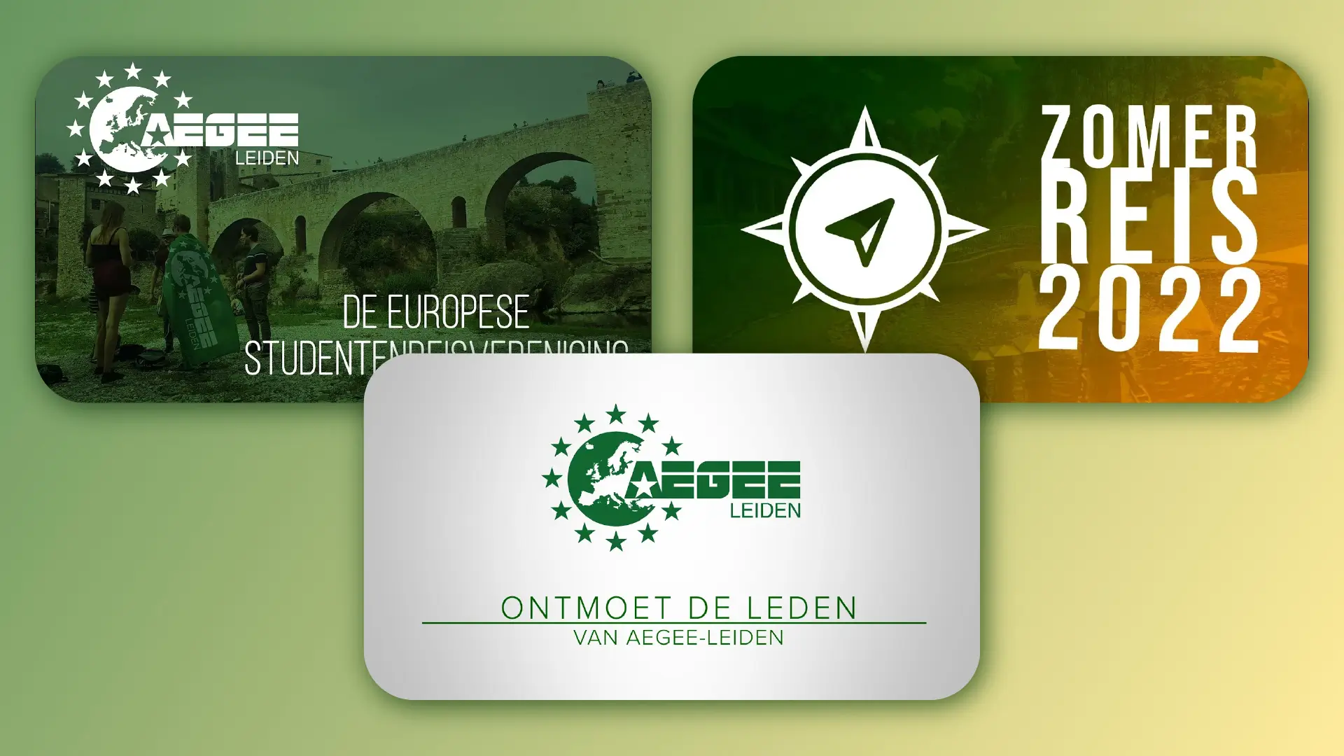
Each icon would have some versions available, depending on the context in which it would be used. While they can be used in monochrome (see, for example, the icon at the start of my summer trip 2022 aftermovie), there are also versions with a gradient fill or backdrop. In those cases, each icon would have a gradient going from the characteristic green of AEGEE-Leiden to one of the five colours used by AEGEE-Europe, the umbrella organisation of all AEGEE locals.
The animations
The common format of the icons enabled me to create consistency among the animations as well. Each would have the backdrop circle and ring animate in first. Next, the glyph and border apear in a custom way. Here, too, I made two versions: a long version where a lot would happen before the circle and ring are formed, and a shorter version in which they appear immediately.
Below, you see the short version of the Borderless Travel icon, but I will discuss each icon in more detail using the long versions.
Borderless Travel
This icon — the only one of this set that was designed by Iris — clearly shows a compass needle as the glyph and a compass rose as the border. The ‘intro’, in which the filled circle and ring are formed, is perhaps a bit dizzying. It starts off by forming a star, as that is a common symbol within AEGEE — a reference to the flag of the EU. Both the glyph and the border rotate before halting in their final position, symbolising finding your way when travelling.
Leiden’s “Gezelligheid”
This one, referred to as ‘Leidse Gezelligheid’ in Dutch, is my favourite. The glyph represents two people at a bar with two drinks, but it also contains the shape of an upturned key — a reference to the city of Leiden. The components jumble around rhythmically, evoking thoughts of music and dancing. As the drinking cups empty, smiles appear on the faces of the people. The border represent four chairs around a table (viewed from above), and at the end of the animation, they move towards the ’table’ as if people are sitting down.
European Network
Unlike the other icons, the glyph (a map of Europe) covers the entire circle instead of being centered within. The border consists of stars, similar to the logo of AEGEE-Leiden but more importantly that of AEGEE-Europe. The glyph appears as if zooming in on a globe, and the flip of the icon at the end should be reminiscent of a waving flag.
Close Friendships
I remember struggling a bit to make this animation work. The glyph is a bit abstract, showing three people connected to each other, vaguely resembling a flower. In the animation, the three people are connected together, and making this look natural was quite the challenge. The border is a chain of hearts, blossoming as the people come together.
Personal Development
The glyph here shows three people of increasing size, shaped like upward arrows, symbolising growth. Animating them to move upwards was quite straightforward. Here, the border is a bit more abstract, showing more arrows moving in a circle. The first two that appear ‘spread their wings’ in a sense, before embarking on a journey to the other side of the circle. As they go, they leave a trail of smaller arrows behind, symbolising the steps taken in personal development.
Conclusion
While making these animations was a fun challenge, I haven’t done any other significant work in Adobe After Effects since. Nevertheless, it was a great learning experience, and I am proud of both the end results and the way I structured the project. I could easily export it to a motion graphics template (a .mogrt file, which is essentially an After Effects project that can be used in Premiere Pro), in which the user can choose the icon to animate and the colours to use. Feel free to test it out yourself by downloading the short version or the long version of the animations.
This post ended up being a lot longer than I anticipated — I hope it was worth the read!